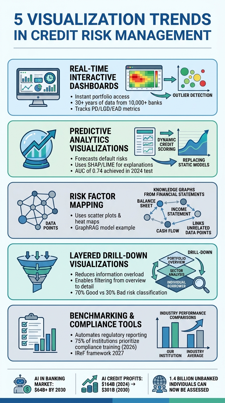
Credit risk management is evolving, and data visualization tools are leading the way. These tools transform complex datasets into actionable insights, helping financial institutions monitor risks, make informed decisions, and meet compliance standards. Here are the five key trends shaping this space:
- Real-Time Dashboards: Provide instant access to portfolio data, flagging anomalies and improving decision speed.
- Predictive Analytics: Use historical and real-time data to forecast risks, offering insights into borrower behavior and market changes.
- Risk Factor Mapping: Connects diverse data points to identify hidden patterns, enhancing risk evaluation.
- Layered Drill-Down Visualizations: Allow users to explore data hierarchically, reducing overload and improving clarity.
- Benchmarking & Compliance Tools: Simplify regulatory reporting and enable performance comparisons with industry standards.
These trends are not just about better visuals – they’re about smarter, faster, and more transparent credit risk management. Whether it’s tracking defaults, analyzing borrower patterns, or meeting compliance requirements, visualization tools are becoming indispensable.
5 Key Visualization Trends Transforming Credit Risk Management
Power BI Credit Risk Analysis: Top 5 Banking Dashboards
sbb-itb-2d170b0
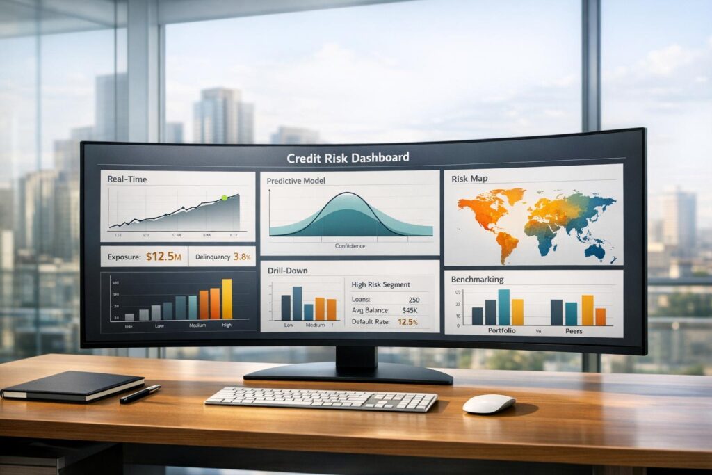
Trend 1: Real-Time Interactive Dashboards
Real-time interactive dashboards bring together loan portfolios, credit ratings, transactions, and economic benchmarks into a single interface. This integration means no more switching between systems or manually piecing together reports. Risk managers can get a comprehensive view of their credit exposure in seconds, allowing them to act quickly when conditions change. These dashboards also play a vital role in verifying data and spotting anomalies.
Platforms like Visbanking have taken this to the next level, aggregating over 30 years of data from more than 10,000 banks and 5 billion records. Key metrics such as Probability of Default (PD), Loss Given Default (LGD), and Exposure at Default (EAD) are tracked to measure risk across portfolios. By automating data collection, these tools minimize manual work and reduce errors.
Data Quality Checks
Real-time dashboards come with features that improve accuracy and speed up risk management.
For example, automated validation processes spot data errors and inconsistencies as they happen. If a credit score falls outside the standard 300–850 range or payment records are missing key information, the system flags these issues immediately. This prevents flawed data from skewing risk assessments and ensures decisions rely on reliable information. Dashboards that update regularly – whether daily or weekly – help maintain alignment with the portfolio’s current status.
Portfolio Outlier Detection
Interactive filters allow users to sort data by region, loan type, or delinquency status, with visuals updating in real time. Tools like heat maps and bubble charts (where bubble size reflects the level of risk) make it easy to identify risk concentrations and spot borrowers behaving outside the norm. Conditional formatting adds another layer of clarity – for instance, loans over 90 days overdue might appear in red, while loans in good standing show up in green. Even a sudden spike in transaction declines can act as an early warning sign for larger problems like systemic credit issues or potential data breaches.
Trend 2: Predictive Analytics Visualizations
Predictive visualizations are reshaping how lenders assess default risks by leveraging historical loan data and converting it into real-time forecasts. These tools analyze a mix of demographics, financial history, and loan attributes, transforming them into visual representations of risk. Moving beyond traditional credit scores, lenders now rely on metrics like debt-to-income ratios, loan-to-income ratios, and credit utilization to predict defaults with greater accuracy.
Modern tools like SHAP and LIME provide detailed explanations for risk scores. They generate explanation cards that pinpoint the factors behind a high-risk rating, such as short employment history or high credit utilization.
"Financial regulators increasingly require that credit risk models are explainable. You cannot just say ‘the model said no’ when denying a loan. You need to explain which factors drove the decision." – Nawaz Dhandala, Author, OneUptime
The move toward dynamic credit scoring has introduced real-time data into risk assessments, replacing static historical models. This approach allows lenders to monitor credit risk profiles continually, adapting to economic changes more effectively than older systems. With global inflation expected to drop from 6.8% in 2023 to 5.2% in 2024, predictive models must incorporate these macroeconomic trends to ensure portfolio stability. By combining predictive models with detailed visual tools, lenders gain a more comprehensive understanding of borrower risk.
Borrower Risk Patterns
Visual tools like charts and graphs make it easier to identify patterns in borrower behavior that raw data might obscure. For instance, histograms and density plots can highlight the distribution of Probability of Default (PD) values across a portfolio, helping managers spot risk concentrations and set thresholds. Scatter plots reveal relationships between variables, such as credit scores and loan amounts, uncovering correlations that might otherwise go unnoticed.
Machine learning outputs are often visualized through decision trees and feature importance charts, which help explain how algorithms classify borrowers based on hidden factors. For example, a bar chart might show the weight of different factors contributing to a risk score. Similarly, risk segmentation visualizations use matrices to group borrowers into categories like Low, Medium, or High risk based on predicted default probabilities.
In February 2024, RiskSeal tested a predictive model for a Spanish digital lender, aiming to improve default prevention. By analyzing digital footprints and using machine learning, the model achieved an Area Under the Curve (AUC) of 0.74. This project highlighted how visualizing atypical behavior patterns can identify potential defaulters that traditional credit scores might miss.
Lending Decision Support
Building on these insights, predictive visualizations also enhance lending decisions. Tools like heatmaps and treemaps illustrate the distribution of credit ratings across different sectors and regions, making it easier to identify areas with high risk concentrations. Waterfall charts and tornado diagrams are used to show how specific stress factors – such as unemployment or inflation – affect credit risk metrics.
Interactive dashboards allow risk managers to simulate scenarios, such as how rising unemployment might impact default rates. Geographic tools like choropleth maps and bubble maps visualize credit risk by location, helping lenders pinpoint high-risk regions and develop targeted strategies. These geographic insights are particularly useful for assessing credit risk in unbanked populations, where alternative data becomes crucial.
With the U.S. loan default rate projected to reach 3.5%–4.0% in 2024, continuous monitoring of model performance is essential. Machine learning models can lose 20% to 30% of their accuracy within 12 to 18 months if not retrained on updated data. Tools like Power BI can set up dashboards to track when features deviate beyond acceptable thresholds, triggering retraining to maintain accuracy. This kind of ongoing monitoring supports a more agile, data-driven approach to risk management as economic conditions and borrower behaviors evolve.
Trend 3: Risk Factor Mapping
Risk factor mapping is transforming how lenders evaluate risk by connecting seemingly unrelated data points. Instead of relying solely on credit scores, modern tools use scatter plots and heat maps to link variables such as loan amounts, default rates, geographic areas, and industry sectors. These visual tools uncover patterns that traditional spreadsheets often miss, like clusters of borrowers with shared risk factors or regions prone to higher default rates. This approach delivers deeper insights and lays the groundwork for automated analysis.
In a notable example from April 2025, Neo4j showcased its GraphRAG model, which analyzed 10-K filings to assess risks tied to lithium shortages. The model revealed Ford’s heavy reliance on suppliers for lithium, cobalt, and nickel, highlighting potential production disruptions. Similarly, it mapped Tesla’s dependency on lithium-ion cells, noting how supply instability could impact profitability. The system also identified Panasonic as a key supplier facing similar risks, illustrating a web of interconnected vulnerabilities across the industry.
"GraphRAG not only retrieves data but also connects diverse indicators. It identifies patterns across seemingly unrelated disclosures, commodities reports, and even environmental events – surfacing what a traditional model might miss entirely." – Paolo Delano, Solutions Engineer, Neo4j
Financial Statement Visualization
AI-driven visualization tools are making financial data more accessible and actionable. These tools can extract information from unstructured sources like 10-K filings or balance sheets and convert it into structured formats like knowledge graphs. This automation not only reduces errors from manual data entry but also allows analysts to focus on interpreting the visualized data. Large Language Models now play a key role in transforming raw datasets into dynamic, interactive graphs that support real-time risk assessment.
Risk Concentration Analysis
Risk concentration analysis goes beyond detecting anomalies by using heat maps to highlight potential risk hotspots. These visual matrices use color coding – red for high-risk areas, green for low-risk zones, and neutral shades for moderate risk exposure. For instance, the European Banking Authority developed a credit risk dashboard as part of a transparency initiative involving over 100 banks across the EU. This tool enabled users to filter and analyze exposure, Probability of Default (PD), and Loss Given Default (LGD) by country and asset class. The result? Improved transparency and better resource allocation strategies for managing regional risk dynamics.
Trend 4: Layered Drill-Down Visualizations
Layered drill-down visualizations tackle the challenge of information overload in credit risk management. These tools provide a summary view with the ability to drill deeper into the data, creating a structured hierarchy that reduces the mental effort needed to analyze complex datasets. By eliminating the need to manually comb through endless spreadsheets, they streamline the decision-making process for analysts and stakeholders alike. Building on the capabilities of real-time and predictive tools, these visualizations offer a more detailed and actionable perspective.
In 2025, Nova Bank’s credit risk analysts Siddesh Pardeshi and Nasir Hussain adopted ZoomCharts Drill Down PRO visuals in Power BI to enhance their loan portfolio analysis. Using tools like Drill Down Donut and Combo Bar visuals, they uncovered high-risk borrower segments by analyzing key factors such as loan grade, debt-to-income ratios, and interest rates.
Static vs. Layered Visualization Comparison
The transition from static reports to interactive dashboards has changed the way risk teams operate. Static visualizations often provide a limited, "black-box" view that can leave stakeholders frustrated when the underlying data or logic isn’t transparent. In contrast, layered visualizations empower users to interact with the data – filtering and exploring how credit risk metrics shift across borrower demographics, loan purposes, or geographic regions.
| Feature | Static Visualizations | Layered Drill-Down Visualizations |
|---|---|---|
| Clarity | Can appear cluttered with multidimensional data | Delivers a clear overview with details available on demand |
| Interactivity | Fixed views; new reports needed for different segments | Allows dynamic filtering and one-click variable switching |
| Depth | Limited to summary-level insights | Enables detailed exploration into specific data points, like loan categories |
For example, in a benchmark analysis of the German Credit Risk Dataset, 70% of applicants were classified as "Good" risk, while 30% fell into the "Bad" risk category. The average credit duration was 20.90 months, with an average installment rate of 2.97%. Layered visualizations make it simple to delve into these segments, such as identifying why certain large loan defaults might occur within the "Good Risk" group. This capability supports more proactive portfolio management and builds on prior advancements in data visualization.
Portfolio Health Metrics
Expanding on earlier approaches, portfolio health metrics now offer a more detailed view that’s crucial for modern credit risk management. These dashboards go beyond basic data comparisons by embedding tools that show the percentage of loans in various risk categories. For instance, in February 2026, a SAS Visual Analytics dashboard used interactive "Key Value" objects to provide real-time updates. As users explored specifics like loan types, the risk team pinpointed high-risk areas using geospatial maps and delinquency buckets for 30-60-90 day periods. This allowed them to detect early warning signals before they escalated into significant challenges.
Drilling down further, analysts can move from total exposure to individual borrower profiles, examining factors like employment type, loan purpose, and credit history. This multi-dimensional analysis helps uncover the underlying causes of trends – whether it’s a regional issue, a particular loan grade, or an interest rate bracket driving delinquencies.
"Credit risk visualization enables financial institutions and stakeholders to assess and manage credit risk effectively. It helps in identifying potential risks, making informed decisions, and improving overall risk management strategies." – FasterCapital
Trend 5: Benchmarking and Regulatory Visualization
Emerging tools are taking interactive and drill-down visualizations a step further by incorporating benchmarking and compliance metrics, offering a more comprehensive approach to risk management.
These tools bring together data from multiple sources into a single, cloud-based platform, simplifying performance analysis and compliance tracking. As regulations continue to evolve – like the European Central Bank’s Integrated Reporting Framework (IReF) set for 2027 – financial institutions need visualization tools that can handle increasingly detailed compliance requirements. This has driven the adoption of self-service analytics capable of processing large datasets with precision. As Mairead McGuinness, European Commissioner for Financial Stability, Financial Services, and the Capital Markets Union, stated:
"Supervisory authorities and the financial sector need to work together to deliver a reporting system that gives supervisors the data that they need while increasing efficiency and minimizing the burden for reporting entities".
Compliance Dashboards
Compliance dashboards have become indispensable for automating data verification, streamlining regulatory submissions, and reducing manual errors. In 2026, 75% of financial institutions identified compliance as a key focus of their training programs – a 14% jump from the previous year. This shift underscores how regulatory compliance is increasingly viewed as a strategic advantage rather than just a regulatory obligation.
These platforms integrate internal data to break down silos and provide a unified view of compliance efforts. However, integration challenges persist – issues with HR system compatibility rose by 16% in just one year, highlighting the importance of selecting tools that support seamless data management. Institutions that prioritize well-integrated solutions can avoid fragmented oversight and ensure consistent reporting across all departments.
By offering a consolidated view, these dashboards also enhance performance benchmarking, helping institutions align their risk metrics with industry standards.
Performance Benchmarking
Visualization tools now allow institutions to compare their credit risk performance with industry benchmarks and peer organizations. By leveraging extensive historical data, these tools enable real-time comparisons of portfolio metrics, such as delinquency rates and credit score distributions.
Self-service analytics add another layer of flexibility, allowing users to filter data by region, loan type, or delinquency status. Interactive dashboards employ visual elements like heatmaps, line charts, and treemaps to illustrate geographic risk, historical delinquency trends, and portfolio composition. As Aakash Gupta, Client Partner at 4most, put it:
"Institutions that embrace AI, data driven governance, and robust risk frameworks will not only meet compliance demands but also secure a competitive edge in a rapidly evolving market".
Application to Trade Credit Insurance
The visualization trends we’ve explored are transforming how trade credit insurers operate, enabling them to assess risks more precisely, design tailored policies, and navigate market uncertainties with greater agility. For providers like Accounts Receivable Insurance, these tools are key to improving underwriting accuracy and speeding up decision-making, even in the face of geopolitical and economic challenges. Here’s how these advancements are shaping trade credit underwriting.
Risk Profiling for Policy Customization
With advanced dashboards, insurers can now integrate fragmented data from various entities and subsidiaries into a unified platform, delivering daily, comprehensive portfolio insights. Credit managers can effortlessly shift from a global perspective to a detailed breakdown by buyer, group, or country. This granular analysis uncovers hidden risk concentrations that might otherwise be overlooked.
"Coface Dashboard offers us a comprehensive view of claims and their evolution over ten years, including indemnifications and recoveries" – Virginia, Credit Manager, France
Access to up to 10 years of historical data, covering credit decisions, turnover, premiums, and claims, empowers insurers to proactively manage potential losses. Custom contract grouping further refines this process, allowing credit managers to pinpoint underperforming contracts by comparing premiums with claims. This insight enables them to reallocate resources to either high-growth opportunities or areas requiring additional risk management. Using these visualization methods, Accounts Receivable Insurance creates policies that align with each client’s specific risk profile, whether focused on domestic receivables or international markets impacted by trade disruptions.
"They can react more effectively to any deterioration in the risk profile of certain buyers and take appropriate measures, such as adjusting internal credit limits or revising payment terms with customers" – Paul, Credit Risk Director, United Kingdom
Market Analysis and Compliance
Visualization tools go beyond customizing policies – they also enhance market analysis and ensure compliance in trade credit insurance. Predictive analytics help insurers stay ahead of macroeconomic and geopolitical changes that influence trade flows. For instance, when oil prices doubled in early 2026 – from $60 to $120 per barrel – due to conflict in Iran, insurers had to rapidly update their risk models. Visualization tools provided real-time insights into trade route disruptions, such as shipments being rerouted through Oman after the Strait of Hormuz was closed. This allowed insurers to identify alternative routes and adjust credit limits accordingly.
"We are prioritizing data experts because without reliable data in the correct structure, AI cannot deliver accurate results" – Marc Henstridge, Chief Market Officer, Atradius
The credit insurance market has seen a surge in demand from financial institutions, which now account for 60% of inquiries. This is largely driven by the need for capital relief and the increasing reliance on automated compliance dashboards and regulatory reporting tools. Accounts Receivable Insurance uses these visualization technologies to stay on top of global credit insurance regulations, monitor trends in sectors heavily impacted by trade disruptions – like chemicals, petrochemicals, steel, and transportation – and ensure that their policies remain both client-focused and compliant with evolving requirements.
Conclusion
The five trends – real-time dashboards, predictive visualizations, risk mapping, layered drill-downs, and benchmarking tools – are transforming credit risk management from a static process into a dynamic and forward-thinking strategy. By turning raw data into actionable insights, these innovations bridge the gap between technical teams and business stakeholders. This means institutions can now identify signs of borrower distress and spot potential threats well before they result in financial losses.
This evolution isn’t just reshaping how risk is assessed; it’s also driving notable financial opportunities. The market for artificial intelligence in banking is projected to surpass $64 billion by 2030, with profits from AI applications in credit organizations expected to grow from $164 billion in 2024 to $301 billion by 2030. These figures highlight a major change in evaluating creditworthiness, especially for the 1.4 billion unbanked individuals worldwide who can now be assessed using AI-powered alternative data visualizations.
Success in this area hinges on prioritizing transparency over complexity. When using predictive visualizations, it’s crucial to select models with clear, auditable decision-making processes. Tools like SHAP or LIME can help ensure compliance with regulatory standards. A phased implementation approach – starting with high-impact areas like portfolio monitoring – can simplify the process and encourage gradual adoption by users. Above all, maintaining a human-in-the-loop approach ensures that AI-driven insights are complemented by strategic human oversight.
For trade credit insurers like Accounts Receivable Insurance, these advancements offer a critical advantage in managing an increasingly intricate risk environment. Whether it’s tracking portfolio performance across global markets, adjusting policies in response to geopolitical changes, or staying compliant with new regulations, these technologies provide the speed and clarity needed to safeguard clients and stay competitive in the years to come.
FAQs
Which credit risk metrics should a real-time dashboard track?
A real-time credit risk dashboard needs to keep an eye on critical metrics like portfolio delinquencies, default rates, credit exposure, risk scores, and recovery rates. By monitoring these, businesses can evaluate and manage credit risk more efficiently as situations unfold.
How can we make predictive credit risk models explainable for audits?
To ensure predictive credit risk models are clear and audit-ready, Explainable Artificial Intelligence (XAI) techniques are essential. Tools like SHAP (SHapley Additive exPlanations) and LIME (Local Interpretable Model-agnostic Explanations) break down complex models by identifying the most influential factors in risk assessments.
Pairing interpretable models such as RuleFit with post-hoc explanation methods or surrogate models like decision trees can further improve clarity. Additionally, counterfactual analysis is a powerful way to demonstrate what changes would be required to shift a risk outcome. This approach not only aids in meeting compliance standards but also builds trust by making the decision-making process more transparent.
What’s the best way to roll out drill-down and benchmarking visuals without disrupting workflows?
Interactive dashboards with intuitive navigation are key for integrating drill-down and benchmarking visuals without interrupting workflows. Platforms like Power BI offer custom visuals that support dynamic filtering, hierarchical data exploration, and clear KPI displays. Focus on creating designs that are easy to use and seamlessly fit into existing systems. This approach ensures that risk managers can dive into data layers and benchmarks effortlessly, transforming complex insights into practical, data-driven decisions.